Though you don’t have to search out art exhibitions about love in February, let’s not totally dismiss a love-based theme around Valentine’s Day. Whether in or out of a relationship on February 14th, each year we are forced to look at our love life and define it within a few rigid categories. It’s not Valentine’s Day that is stupid and childish, it’s the way we are pressured to enter into it that is. Remember in First Grade when you had the same juice box as another kid of the opposite sex? You were in love, and there were “Ooohs†all around the lunch table for about three seconds, and then some kid would realize their mom gave them cheese curls instead of fruit snacks and everyone’s attention would shift there. Your romantic partnership with your juice king or queen was over as suddenly as it began. This is how society wants to define your love around Valentine’s Day: make it fit into an easy to read category, point at it, crap on it, and throw it into the back of the closet until the next year. As people, we think about love year round, and understand its complexity, or at least try to. Artists, unsurprisingly, have thought about love since the beginning of art: The Venus of Willendorf was a symbol of fertility. Cave paintings had copulating couples in them. The columns of ancient Greece and Rome were phalluses holding the stone vulva towards the heavens. The incorporation of Two Point Perspective in art was an attempt to see the other as equal to the self. (Three point Perspective was crushed early on by the Catholic Church due to its kinky nature.) Mondrian made his grid paintings over love letters he never sent to his mistress. OK maybe none of this is true, but love has been on our brains forever.
So then, Butter Projects, in downtown Royal Oak, MI mounts a show in February to celebrate Valentine’s Day. Except it isn’t really love that the artwork in the show explores. The artists chosen are left to follow their own muses. Instead, it is the curation and framing of the exhibition that talks about love. Real 24/7 warts and all kind of love, even if it doesn’t appear flat out in the work. Already, this is a better take on the Valentine themed art exhibit. Curated by Alison Wong, “I Like You and I Together,†on view until March 16, allows our experience with love to be the biggest thing in the room, in the air around us instead of plastered on the walls. Interestingly enough, Wong, who has been running Butter Projects solo for the past several months, will soon be joined by her partner John Charnota. She will continue her role as director and curator, while he implements new programming for the gallery. This adds to the overarching theme of love in the exhibition, with the gallery now helmed by an artist couple. It is no surprise then that the idea for this exhibition had been in her mind for quite some time. Though timed for February, perhaps the logistics  made it a longer reaching project, as the typical studio visit becomes a negotiation of the partners’ work in relation with each other as well as the fit with the gallery’s mission. In the case of the ten artists on view, or five artist couples, Wong presents a way of seeing the work of artists in context with their partner as a means of fully understanding their work individually and the influence that their relationship has on their work.

From left: Ben Schonberger, “Green Field Gold Shop”, “Untitled Perpetrator Self”; Zachariah Szabo, “Zachariah” Archival inkjet prints
Recalling work by Millee Tibbs in her 2007 series “This is a Picture of Me,†Zachariah Szabo’s photographs recall his childhood by re-staging snapshots taken of him by his parents. He recreates clothing and settings through a combination of craft materials and what is on hand, allowing for both planning and spontaneity. Symbols of adolescence and young adulthood enter in as props, like a cigarette or a beer in hand. The photos lament the loss of childhood for sure, but they also are brimming with camp: the elaborate outfits he was dressed in as a child result in satisfying costumes with a homemade sensibility that become lyrical to the photo. A previous work has him clutching a raw chicken in front of his face with a seductive look. Here, with “Zachariah,†he reclines in something from the Von Trapp Family wardrobe, complete with socks longer than his shorts. What appears as his birthday party ends up as a fashion shoot while pining for lost youth as self portrait. His partner, Ben Schonberger’s “Untitled Perpetrator Self†shows the artist in black face with carelessly open legs and glitter on his crotch, receptive to the $ sign print to the left (Green Field Gold Shop). That black face can be momentarily de-politicized by sparkle crotch is brilliant, as they cancel each other out as transgressive symbols of far more complex issues. The racist history evident in black face is countered by queer politics: while one seems a dark part of our past, the other is still a pressing issue that is no longer willing to be ignored, both far too often unjustly seen as suspect. Ben becomes a new character, a combination of forgotten and fringe, caught in the wrong spot at the wrong time, but definitely not us, who are able to view the images. By showing exploitable characters as fantasy versions of the self, both artists allow the viewer safe access into that person, tinged with anxiety, and transgressive erotica. (What’s more erotic than a giant red $?)

Top: Travis Roozee, “Spilled Pills”, Ultra Chrome Print. Bottom: Ashley Allen Short,”Washed-up Lake Michigan Balloon” (four separate versions) Gouache and chalk
Focusing on the beauty in the everyday are Ashley Allen Short and Travis Roozee. The couple have been tracking the sublime moments that are possible from attention to one’s surroundings for some time, through separate studio practices. Seeing their work together allows similar themes to be strengthened. Shorts’ reverent gouache paintings of balloons that washed up on Lake Michigan’s shore contain a sense of dreamy longing. Deflated, they are like glass bottles with messages that arrived too late. The bright colors she uses only reaffirms the sense of loss and pathos. Conversely, Roozee’s Spilled Pills is mostly grays and white, with just a hint of washed out pastels. Scattered across a bathroom sink top, the pills are on parade, dissolving in the splashed water on the top of the sink. What could be a moment of anguish becomes an acceptance of things beyond one’s control. The pills lose their ability to function, as they cannot control any condition in their disorder.

Top: Seth Farnack, “Dwarfs. Nocturnes for Snee Whittchen”, Archival Inkjet prints and audio recordings. Bottom: Bridget Mae Farnack, “Good Fortune” mixed media
Seth Farnack uses repurposed objects to create new narratives within a closed system, in this case, Snow White. Digital technology is translated with analog in Dwarfs. Nocturnes for Snee Whittchen. His Seven Dwarves are synthesizers which he circuit bent, and Snow White is a Facebook page avatar perpetually sleeping on the internet. The page is populated with music with the altered synthesizers, as the score for Disney’s Snow White and the Seven Dwarves re- imagined in seven sections. They are spontaneous sounding songs recorded on a smart phone and then played back on one in the gallery. While interesting in theory, the sounds the synthesizers produce are brash and unrefined, and so many of them lack longer listenability. The music is improvised but unlearned, and poorly recorded due to the use of the smart phone. Potentially endearing, the missed notes are far more than occasional, but not consistent enough to be purposeful, as it is clear that the sections want to fit within conventional song structures. Only “Makin’ Pies†hits the mark, turning the other’s negatives into success by achieving an of the moment lo-fi bliss that improvisation occasionally offers us. Bridget Mae Farnack also repurposes found objects, shifting them out of their original form or function. Most interesting is the consumer function: marble and wood that might be sold at a home improvement store return to their traditions as art materials through the DIY market filter. Other objects are abstractions of consumer products made from plastic, ceramic, paper and food. Good Fortune is a collection of charms, and though seen as individual works, offer a one to one relationship to each other. They are precious in their simplicity and tactility, yet, as their title suggests, carry a sense of the knick knack. This dual role keeps the viewer engaged to determine their own relationship to them, while enjoying the object’s rewarding presence.

Lauren Rice, “The Light” Spray paint, acrylic, gouache, graphite powder and collage on paper

Brian Barr “Heavy is the Head” Gaffer’s tape on linen, collage on duralar on drywall, photo on plywood
The Light, by Lauren Rice, continually tries to contain chaos within material and architectural frameworks, ultimately succumbing to the organic shapes that have crumbled to the floor below the work. Pastel washes and spray painted soft edges evoking Frankenthaler co-mingle with hard edge stenciled borders. A loose rectangle of hot pink spray paint creates a frame to mimic the lavender wall. Also incorporating the gallery architecture into his work is her husband Brian Barr, whose installation Heavy is the Head involves many framing elements to work with formal concerns inherent to materials and methods in the works. A leaning sheet of plywood framing an eerie gray photograph of a marble bust, the camera shake featuring as a prominent aesthetic element. An altered book page about Greek Mythology is centered on a generously large area of the wall lightly demarcated by a sheet of duralar, echoing the canvas covered in black gaff tape next to it; the tape being framed by the size and shape of the canvas.
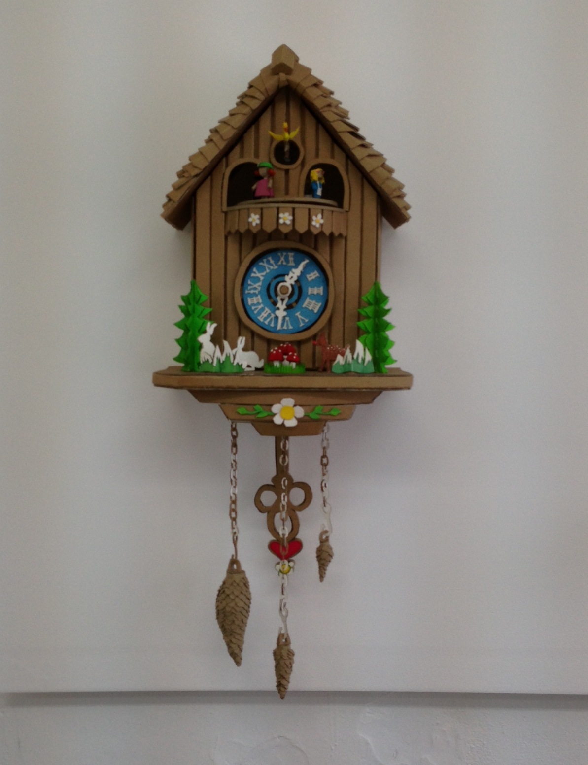
Shannon Goff, “Cuckoo” cardboard and gouache
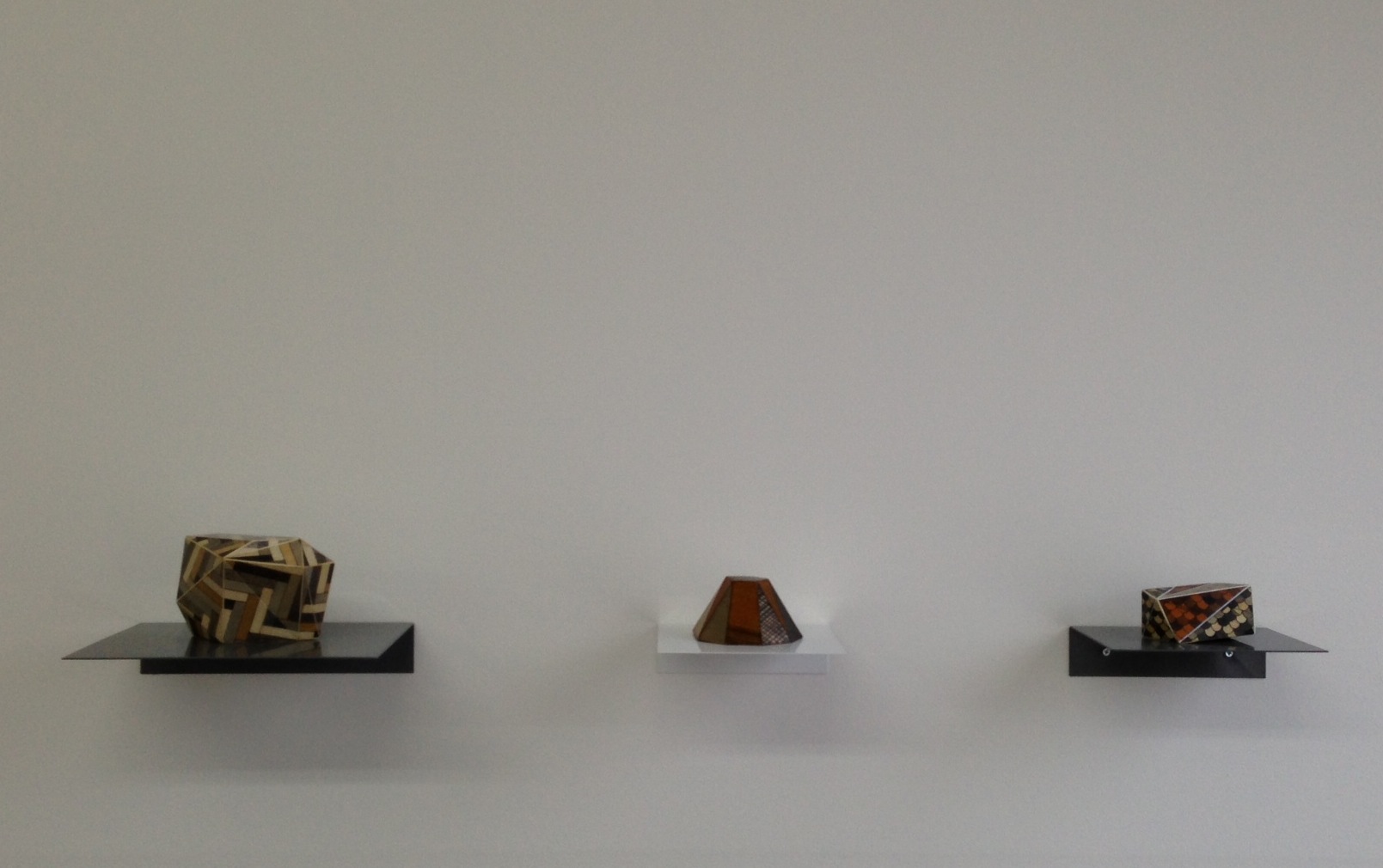
Tom Lauerman, From left: “Parquet Building Block”, “Frustum” and “Building Block #3” Wood, ink, paper, shellac and gouache
Also on view is Shannon Goff’s Cuckoo, a painstaking rendition of a cuckoo clock made out of corrugated cardboard, alongside her husband, Tom Lauerman’s wood and paper laminated small scale sculptures (Parquet Building Block, Frustum and Building Block #3). Together they re-enforce obsession and virtue of crafted objects while evoking Pop Art and Minimalism. Goff often re-creates quotidian objects out of cardboard or clay, while her husband, Tom, continually leans towards architectural forms in abstract languages.
“I Like You and I Together†will be on view until March 16th, 2013 at Butter Projects, 814 W. 11 Mile Rd, Royal Oak, MI
Website: www.butterprojects.info
Email: butter.projects@gmail.com
Hours: Open Fridays 1-5pm and Saturdays 1-3pm during the run of the exhibition. Additional hours available by appointment, email to schedule.
Note: A previous version of this article stated that Zach was holding a chicken in front of his chest near a jungle gym, which is just plain wrong. Also, that Ben had pink lipstick on instead of glitter on his crotch. While pink lipstick is often like a glittery crotch, a glittery crotch is so much more than pink lipstick. Critics often do not know what they are talking about. Many thanks to Alison Wong for making me aware of these over sights.
- Media Theater - January 14, 2015
- The Armchair Critic: Mike Kelley’s “Channel #1, #2, #3” - December 10, 2014
- In a Clutter of the Digital made Physical, Tiny Diamonds in the Expanding Ruff - November 12, 2014