Guest post by Alex Fuller
Chicago’s Lampo is a nonprofit organization that has been presenting experimental music and intermedia projects since 1997. Over that time, Lampo also has maintained a strong focus on design in its printed promotional materials. Running through January 17, the Post Family is showing a mini-survey of Lampo design work, drawn from the sound organization’s 15-year archive. The Post Family’s Alex Fuller speaks with Andrew Fenchel and Alisa Wolfson from Lampo:
Alex Fuller: How did Lampo get started?
Andrew Fenchel:  When I started things in ‘97 I had no special expertise in music. I was a fan. I’d been listening to weird stuff since high school and going to shows since college. I liked that moment of discovery, especially live, with other people around and the artists there. I wanted to make that happen. I had no background producing events, and I learned as I went along. In retrospect, the lack of experience was helpful. I didn’t know what I was getting into or why I shouldn’t do it. But I wasn’t a complete fawn. I had spent some time around art museums through a couple of internships. I began thinking as much or more about the artists, rather than just the audience, recognizing that Lampo could offer extra support for their work. And I believed producing beautiful design would help make each project special. Alisa and I first met when Lampo was just about a year old. So, design was almost always integral to the idea.

Fuller: Much of the sound you present is electronic. Why was print appropriate for the design work vs. digital?
Fenchel: Most of the things we’ve produced have a practical function. Posters and postcards are promotional. Program notes are educational. From the beginning Alisa and I also talked about a secondary idea, considering the stuff as artifact. Print is what is left over. It extends the identity of the organization and documents the work. But beyond that, I also had something sort of poetic in mind. That might not be the right word. I’m very interested in the relationship between the live experience, the memory of that experience, and the tangible printed remains. We brought that present and past idea into our design. Like any time-based event that happens and then is over and done, there is the act of reading the words on the poster, and then later an understanding that now it has been read, or red — a color we use a lot. It was kind of a private joke.
Alisa Wolfson: Graphic design is something I do for work. Like Andy said, we met when Lampo was just starting. So, we began our relationship looking at and talking about design and ephemera. We wanted to make things for Lampo and felt a responsibility to the artists to do that. We also both love Fluxus and were inspired by its focus on live performance and dedication to capturing the moment through print. And, print it was and will be. It’s the family business
Fuller: How do you curate the Lampo program?
Fenchel: Lampo is structured as a series of select programs, to keep things special for the artists and the audience. I try to create relationships between events, within and across seasons, but I’m not interested in being didactic about those connections. They’re not secret, but I prefer to be suggestive and not say more. My goal is to keep the program varied but linked. It’s a fun challenge, like a puzzle. What is most important to me is that we work with artists who will be able to take advantage of the invitation, and whatever resources and energy we can offer, to do something they might not otherwise be able to do.

Fuller: Has the graphic identity changed over time?Â
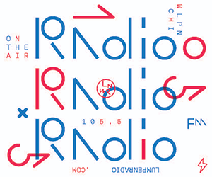
Wolfson: I remember doing some early weird type experiments to try to make a proper Lampo logo. They all felt manufactured and over designed. Then we started working with Helvetica. For the system and look, we both agreed a tight set of guidelines would help us create authentic pieces that would be true to our idea of Lampo. We wanted something matter-of-fact. We never wanted to mimic sound through visuals. Instead, we started with a limited set of elements, and we continue to work with these in different variations, as we also add new ones or evolve them.
The poster dimensions were determined by how many we could efficiently make on a standard press sheet. The skinny proportion of those posters became a standard we still use in other pieces. Silkscreen was practical and appealing because it was fast and had a really beautiful, tactile quality. To get saturated fields of color, we had to leave a small border around the poster edge. That border then carried through to other pieces, even when not required by the printing technique. We stuck with Helvetica. Type was often all caps, centered, not fussy. The palette was limited too. Andy loves word play. As he mentioned, different shades of red dominated early on, a wink to “reading†in the past tense. Later we expanded to oranges, browns and blues — colors we saw on bricked up Chicago buildings against a perfect Midwest sky.
These days we’ve moved away from silkscreen. We have added plaid as a formal element, an everyday reference to math and pattern. And we introduced a new Lampo Folio series, where we produce large-format booklets to document certain past events that have a more visual component. The way we continue to cycle elements in and out and add new ones is something like the way the Lampo program is curated, too.
Fuller:Â Â The show celebrates more than 15 years of beautiful graphic design and challenging sound art. What was the experience like unearthing your archives?
Wolfson: It was fun and strange and exciting. I feel like I’m such a different person now, but it’s great to see everything together as a group, and really cool to realize what we’ve done. I know we both look forward to doing more.
“Reading Lampo†is on view at the Post Family, 1821 W. Hubbard, through January 17. Visit lampo.org and thepostfamily.com for more information. This Saturday, December 7, the Lampo fall season continues with a performance by ex-Emeralds member Steve Hauschildt at the Graham Foundation.Â
Alex Fuller is one of seven partners in the studio/gallery/blog called The Post Family, founder of 5 x 7 publishing and a Design Director at the Leo Burnett Dept. of Design.
Â
- First there is a man, then there is no man, then there is (The Pina Colada Song) - March 2, 2022
- “What Does It Mean?” - September 29, 2020
- The Reality of Rejection - August 9, 2018